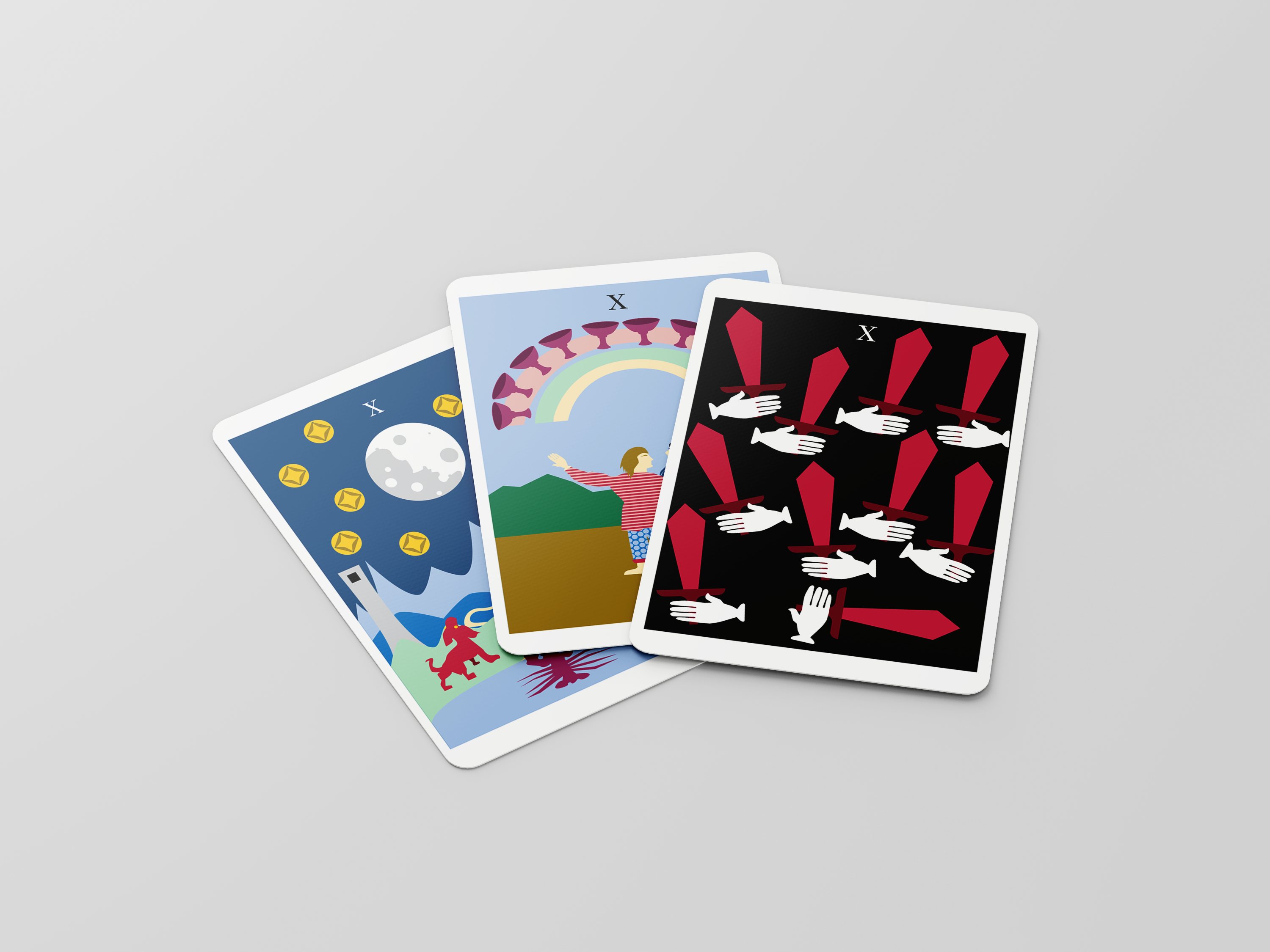
This is an overview of my work in Digital Media Design, at Texas State Technical College.
I began my work with a briefing from the client, listing their details and desires into a guide. From there I was able to begin work on a comprehensive brand idenity.
My first step was sketching out the logo.
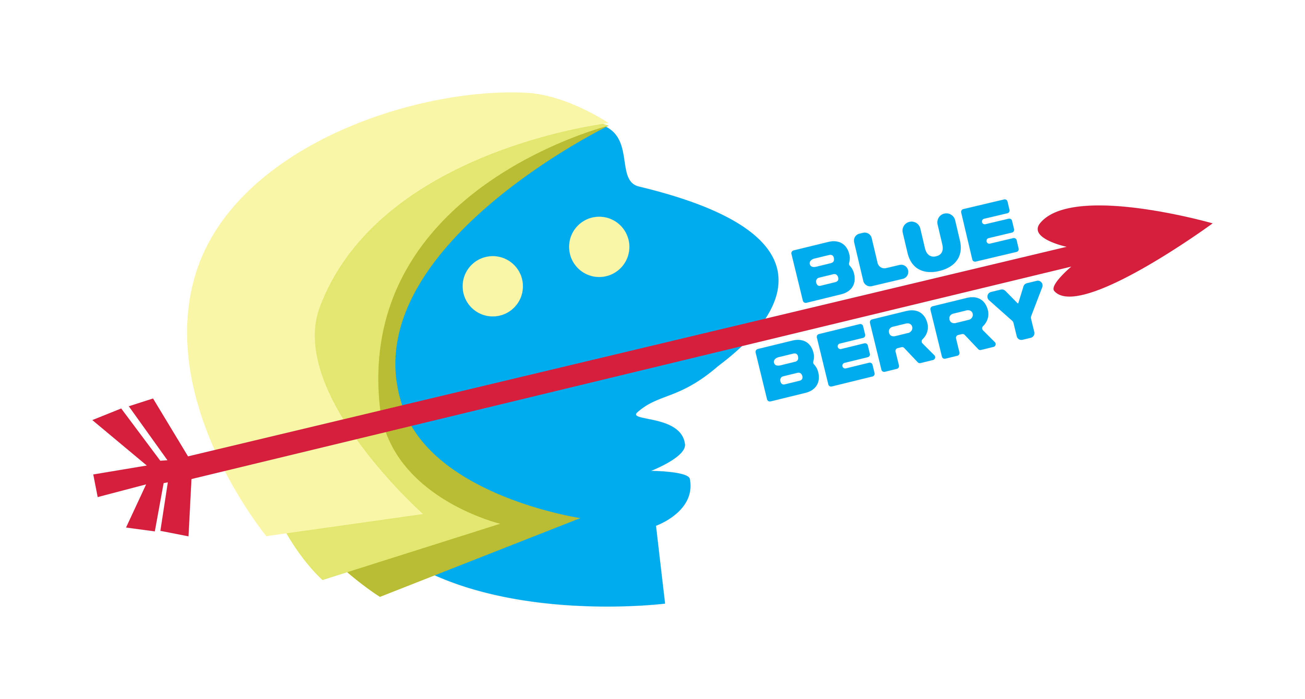
From the sketch I found the logo, an unusal but intresting design.
It calls to mind Artemis the Greek Goddess of nature, childbirth, wildlife, healing, the hunt, animals, virginity, young women, and archery.
Archery and Hunting in the arrow. While the face suggest the moon with bright golden crests of hair and that mysterious blue color as described in the "blue moon" the rare sight of a full moon twice in a month.
I'd also like to connect the Japanese idea of the rabbit in the moon to this design through the shared axis of hunting as rabbits are hunted. I'd use the rabbit again in the logo for cruelty free testing.
The other factors of wildlife, nature, childbirth, healing, virginity, and young women were also important because BlueBerry uses all natural ingredients, is female owned, doesn't use animal testing, and lastly this is make-up for ALL females, it's a means of expression, not having to suggest anything sexual specifically: hence why I didn't go with Aphrodite, Hera, or Hestia who'd be more specific to those other forms.
If this all seems strange do remeber that logos don't actually need to make sense, Apples have nothing to do with computers. That's logo because Steve Jobs likes the fruit and wanted the name to show up first in a phone book.
The BlueBerry logo is bold and stands out using bright primary colors and a slick modern design.
I stand by it completely.
Lastly I put together a mock up learning how to dress the design onto a 3D object.